
































Start with function, not decoration
It’s easy to judge a logo based on personal taste. Do you like the shape? Does the colour feel right? Would you put it on a T-shirt? Those questions matter, but they shouldn’t come first.
A great logo design has one primary job: it needs to work everywhere it’s used. From a website favicon and social profile to packaging, signage and merchandise, a logo should remain clear, recognisable and effective regardless of size or format. If it only looks good as a large hero graphic, it’s not solving the real problem.
Simplicity is a discipline, not a shortcut
The world’s most recognisable logos all have one thing in common. They’re simple enough to remember.
That simplicity isn’t achieved by doing less work. It’s usually the result of exploring dozens of ideas before refining them into one clear solution. Every unnecessary detail that gets removed makes the identity stronger, more memorable and easier to use across different applications.
Simple logos also tend to age better. They rely on strong fundamentals instead of design trends that quickly fall out of fashion.
It has to work at the smallest size
Most businesses think about how their logo looks on a website header or business card. In reality, one of the smallest applications is often the most demanding.
A business logo might appear as a browser favicon, mobile app icon or social media profile image where only a few pixels are available. If important details disappear at those sizes, recognition suffers. That’s why testing a logo at small sizes should be part of the design process from the beginning, not something left until the end.
Colour should support the design
Colour plays an important role in branding, but it shouldn’t be the only reason a logo works.
A strong logo should remain recognisable in black and white, engraved into metal, embroidered onto clothing or printed using a single colour. Once the underlying shape works, colour becomes an asset that strengthens recognition rather than compensating for a weak design.
Originality will always outlast trends
Every few years, certain logo styles become incredibly popular. Eventually, they become so common that brands begin to look interchangeable.
The strongest identities don’t chase trends. They focus on creating something distinctive, relevant and built around the business itself. Good design can feel contemporary without depending on whatever style happens to be popular at the time.
A logo doesn’t have to say everything
One of the most common mistakes in logo design is trying to communicate every part of a business through a single symbol.
A logo isn’t responsible for telling your entire story. Its job is to create recognition. The wider brand identity does the rest through typography, colour, photography, messaging and the overall customer experience.
Trying to communicate one clear idea almost always produces a stronger result than trying to communicate ten.
A great logo is only the beginning
A logo is one part of a successful brand identity, not the finished product.
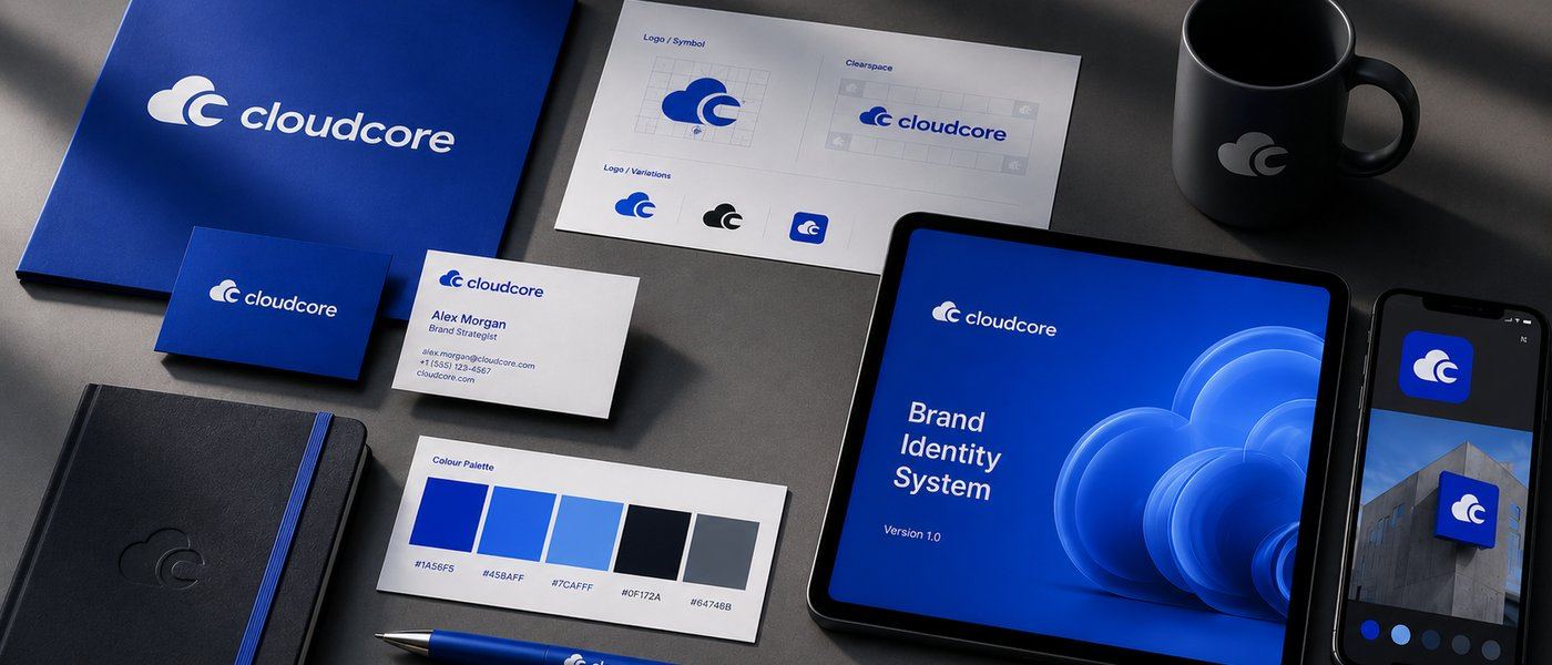
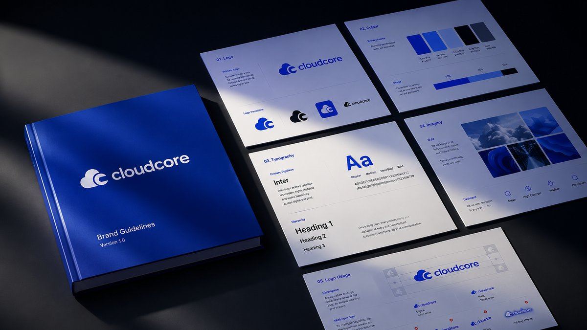
The businesses that build lasting brands combine a strong logo with a consistent colour palette, typography, imagery and clear design guidelines. Together, those elements create recognition over time and help every customer interaction feel connected.
A well-designed logo opens the door. A well-designed brand keeps people remembering who you are.
If you’d like to work with us, get started today.